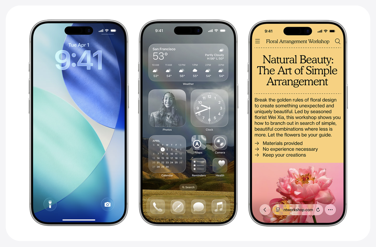
Apple has once again done what it does best: made the internet collectively lose its mind over something shiny. The new “Liquid Glass” design in iOS 26 and macOS 26 has Apple fans divided faster than you can say “Skeuomorphism.” Half the internet is swooning over the aesthetic. The other half wants to know where the contrast settings went.
Here’s my take: it’s one of the most beautiful experience changes Apple has made in years. Yes, some controls are faint enough to make you question your eyesight. Yes, the new Phone app feels like someone reorganized your kitchen drawers just to mess with you. But give it a year—what feels confusing today will seem completely logical once your muscle memory catches up. Apple is basically retraining us, one translucent menu at a time.
Let’s dig into what makes iOS 26 and macOS 26 truly worth upgrading for—beyond the gleam of that glass.
Apple Intelligence (Finally, AI That Feels Useful)
Apple is calling it “Apple Intelligence,” but let’s be honest—it’s AI with Cupertino manners.
On iPhone, the new features actually help. Live call translation in real time, a call assistant that can hold for you (so you can reclaim your life from airline customer service), and smarter text predictions that no longer think “ducking” is what you meant to say.
On the Mac, AI is woven into the fabric of the OS: Spotlight now reads your mind better than your spouse, and Shortcuts can anticipate repetitive actions before you even realize you’re doing them. It’s subtle, understated AI—not the kind that wants to write your next novel for you, but the kind that quietly makes your day smoother.
Liquid Glass: The Boldest Design Since Big Sur
Remember when Apple introduced flat design and half the internet complained that buttons didn’t look like buttons anymore? Welcome to déjà vu. The new Liquid Glass aesthetic gives everything—from Finder sidebars to Messages threads—a translucent, ethereal quality.
It’s as if your entire interface took a yoga retreat. Menus float. Windows breathe. Content stands out. Sure, sometimes you’ll wish for a bit more opacity when sunlight hits your screen, but this is one of those design changes that grows on you. Apple’s UI team seems to be saying: “The hardware is solid, so let’s make the software melt.”
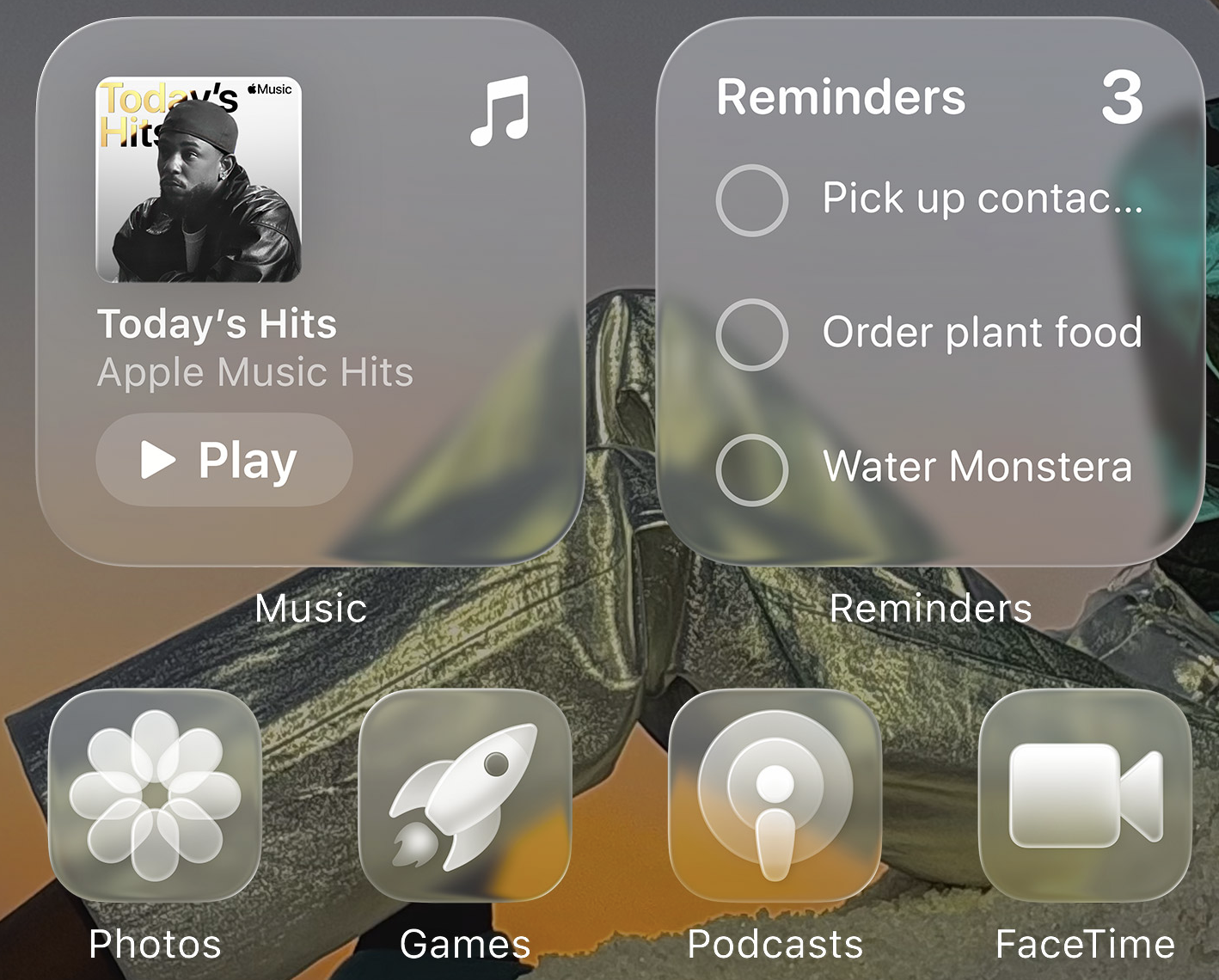
The real treat? You can now customize your app icons and widgets with clear or tinted styles, which means your Home Screen can finally match your wallpaper instead of fighting it.
Smarter Screenshots & Image Magic
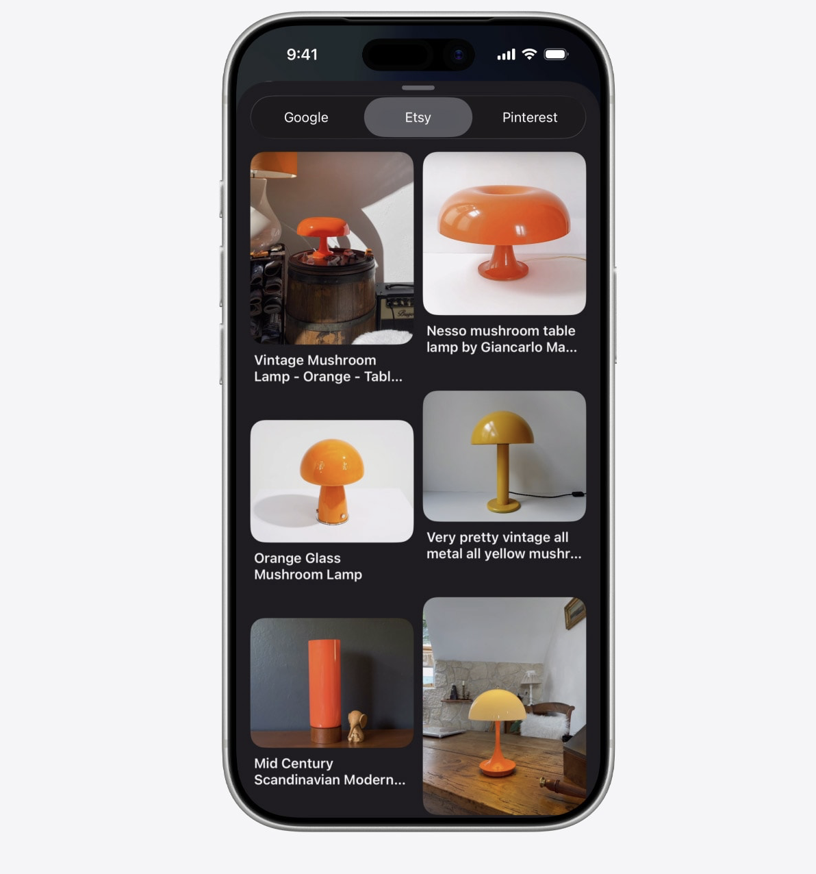
Screenshots are the new search bar. You can now long-press a section of a screenshot and ask Siri—or ChatGPT or Google—what it is. It’ll identify that restaurant sign or landmark without you typing a word.
You can also pull dates directly from screenshots into your calendar (“Dinner at 7” in that photo? It’ll remind you). And the new markup tools let you annotate, crop, and share faster than ever. Basically, screenshots have gone from “evidence” to “productivity.”
Continuity Gets Real-Time
Apple’s ecosystem has always been about continuity—answer calls on your Mac, AirDrop your lunch photos to your iPad, and pretend your devices are one big happy family. Now, it’s gone real-time.
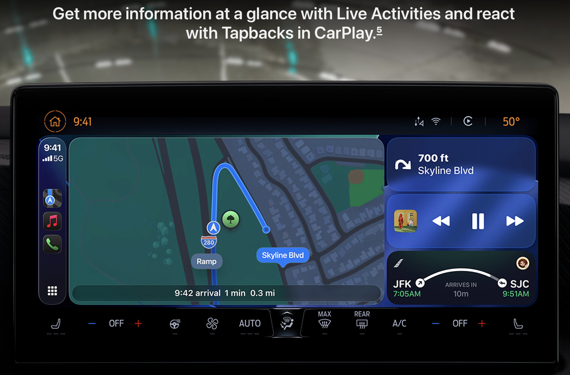
CarPlay supports Live Activities, so you can see your Uber Eats driver crawling toward you in slow motion right on your dashboard. On macOS, those same Live Activities appear in your Menu Bar—whether it’s a food order, a delivery, or a timer running on your iPhone. It’s subtle but deeply satisfying. You don’t realize how much you needed it until it’s there.
Customization Comes to Control Center
Mac users, rejoice: Control Center is no longer a walled garden. You can finally add third-party controls—and even iPhone app toggles—right to your Mac’s menu bar. Tap an icon and, boom, iPhone Mirroring launches instantly.
Safari also got a glow-up: its address bar now shifts colors and translucency based on the site you’re visiting. It’s one of those details you don’t notice until you suddenly feel like every other browser looks dated.
There’s something poetic about Apple’s new direction. With iOS 26 and macOS 26, the company isn’t chasing trends—it’s shaping how glass, light, and AI can coexist without overwhelming the user. It’s not perfect (nothing Apple releases ever is), but it’s forward-looking, cohesive, and, frankly, gutsy.
A year from now, we’ll all be used to this shimmering interface. And we’ll probably forget there was ever a time we complained that the buttons were too transparent.
That’s Apple’s magic: it drags you kicking and screaming into the future—and then makes you believe you always wanted to be there.


